Mouthwatering text—How to enhance your appetizing content with creative design and printing
Chef’s know that the first bite of food is taken with the eyes. An appetizing presentation is as much a part of a dish as what ingredients you use.
But what if the first sampling of your food actually occurred before it arrived at the table? Savvy restaurateurs understand that dining is an immersive experience and that the environment they create can enhance, or detract, from what’s on the plate. Part of that atmosphere includes the very practical and all-important restaurant menu, which sets a diner’s expectations, primes their appetite and influences their selections.
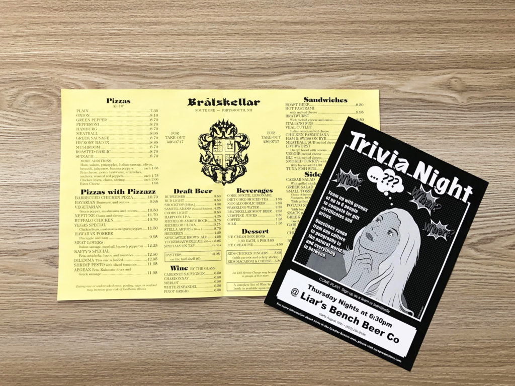
If you think that an inspiring menu is just about the what’s being served, then you are missing three critical components: the fonts, the layout or design, and the material it’s printed on.
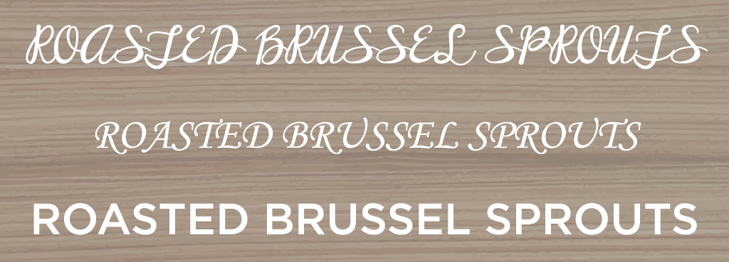
Think of fonts as ambassadors of your brand. A well-selected font reinforces your overall image, whereas a font that is too sharp, too fussy, too bold, or too wispy can create a disconnect between people’s expectations and their experience.
Skeptical? Look at the three different font styles used to describe the same menu item below. Pay attention to the assumptions you are making about the dish, about how it might taste and even the style of restaurant.
Layout
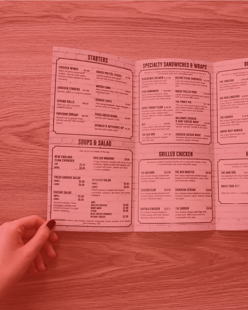
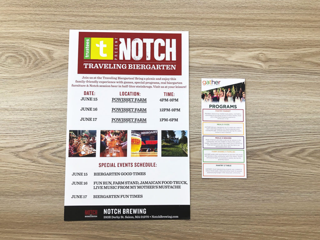
Working with a good graphic designer can ensure that the chef’s vision for the food and your restaurant’s brand is translated correctly on your menu’s design and layout. And a designer who is intimately familiar with the printing process can create a design that translates successfully into a finished product.
Material Choice
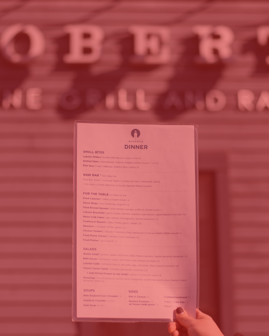
So what about those printed menus? When you read a menu, it seems to be such a simple act. However, dozens of decisions were made to create what you are reading. Restaurant menus can be large or small with a variety of details including sharp or rounded corners, folded or flat, color or white card stocks, coated papers or pre-printed shells. Menus may be handed out individually tableside, wall-mounted boards, banners, posters, sandwich boards, or Z-folded takeout menus.
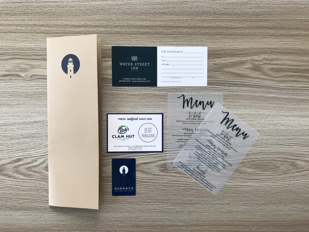
Consider whether a menu needs to be waterproof so it will stand up to spills and general wear and tear over time or whether it needs to be easily and cost-effectively updated regularly. Does the material you are printing on reflect the type of food you are serving?
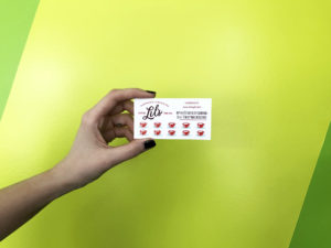
In the end, the decision is yours but whatever you choose, always ask yourself: does my material selection reinforce and complement the design of my menu and will both work together to reinforce my restaurant’s brand?
When you select the right ingredients and combine them with careful attention to detail, you can’t help but achieve excellent results in the kitchen, and at the table.
Ready to create mouthwatering text on your next restaurant menu? West End Creative and Infinite Imagining’s seamless design to print services are just what your next project needs. Contact us to get started.
Read about redesigning menus for mouthwatering results in this case study.
