Connecting with the Broadest Audience: What Learning Styles Teach Us About Messaging
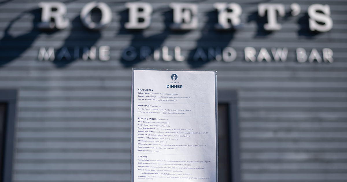
We all absorb information in different ways. Remember all that talk when you were in school about learning styles? Were you a verbal or a visual, an aural or a physical learner? Turns out, whatever you were in a formal academic setting is still how you learn. Whether at work or visiting a museum exhibit in our free time, how information is presented to us has a direct impact on whether or not the intended message is received.
So what does this have to do with printing and graphic design?
More often than not, our preferred learning style is also our default communication style. A verbal learner will likely turn to words, either spoken or written, as their go-to means of sharing information. A visual learner is more likely to draw a graph or use a colorful image to explain a concept. A physical learner might act out or tell a story using props or pace the room while describing something.
But when it comes to effectively communicating a message or a concept to your target audience, it’s important to move beyond one’s personal preferences and find the right blend of imagery, words, and interaction so that your message appeals to a variety of communication (ie. learning) preferences.
Before you tackle your next project, here are a few things to consider:
Articulate a Goal
What are you trying to do?
Are you trying to attract attention or are you sharing information? How long will your audience have to interact with this piece? Will they be just passing by or will you have their undivided attention for a period of time?
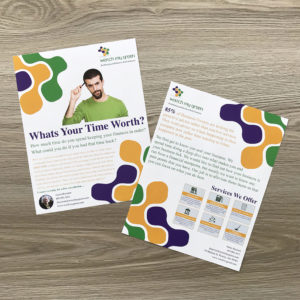
Typically, images with a few key words (like your business name or tag line) are the best at grabbing passing attention, whereas focused audiences have the capacity to digest more complex ideas and text.
Less Can Be More
Too much text or too many images can confuse our eyes and our brains.
Make sure it’s clear what you want your audience to focus on. In this era of three-second attention spans and constant bombardment of images and messages, we are forced to compete or risk being ignored. Our brains are searching for a lifeline in all the chaos, something to grab onto and make sense of. Let your clear, clean presentation be your audience’s lifeline.

Limit Font Styles and Sizes
The font you select, and its relative sizing is as much about what the individual letters in your text will look like as it is about creating a visual layout for your information.
A good rule of thumb is to select no more than two different fonts (or better yet, one font family with different variations) and to limit your font sizes to a hierarchy defined by the text role (Header, subhead, body, caption, etc.). Too many fonts in too many sizes are just as distracting as too many images.
Good design structure allows the eye and brain to focus on the messages you are sharing, in the order you want to reveal the information. For better or worse, we’re trained to read top to bottom, left to right. Don’t let your desire to shake up convention translate into something no one can make sense of.
Your Message is in Their Hands
Give thought to how to communicate to your audience through their fingers.
The weight of the paper, as well as its texture and coating, say something to the person holding your brochure, your business card, or your flyer. It can say high-quality, thoughtful, durable, reliable, economical, experimental, or slick. Make sure your paper echoes the message that is printed on it.
Be Holistic
Challenge yourself to communicate your main idea in multiple ways, which will appeal to each of the different learning styles out there.
Can your idea be communicated through something three dimensional that can be touched, played with or assembled? Is there a song, rhyme or story that captures the essence of your message? How can these things be developed as companions to the standard written word or imagery reflected in your other materials?
As you approach your next project, challenge yourself to balance the verbal, the visual, the aural and the physical. Your audiences will thank you.
Contact us about your next project.
Read our related case study about Rye Historical Society
